Ruthann Hanlon of PPG gave a color presentation at the Garage, Shed and Carport Builder Show in South Bend, Indiana in November. The psychological aspects involved with the color of siding your client chooses are interesting. For instance, did you know that gray is out because people’s mood and outlook are lifting; they’re becoming more hopeful. So goodbye safe, neutral, not-very-cheerful gray. No offense to gray intended…it can be used to stunning effect, but it was hanging out around the top of the colors-used chart for years. Many homeowners are moving on. And here is what the color experts say they are moving to.
PPG’s Color of The Year
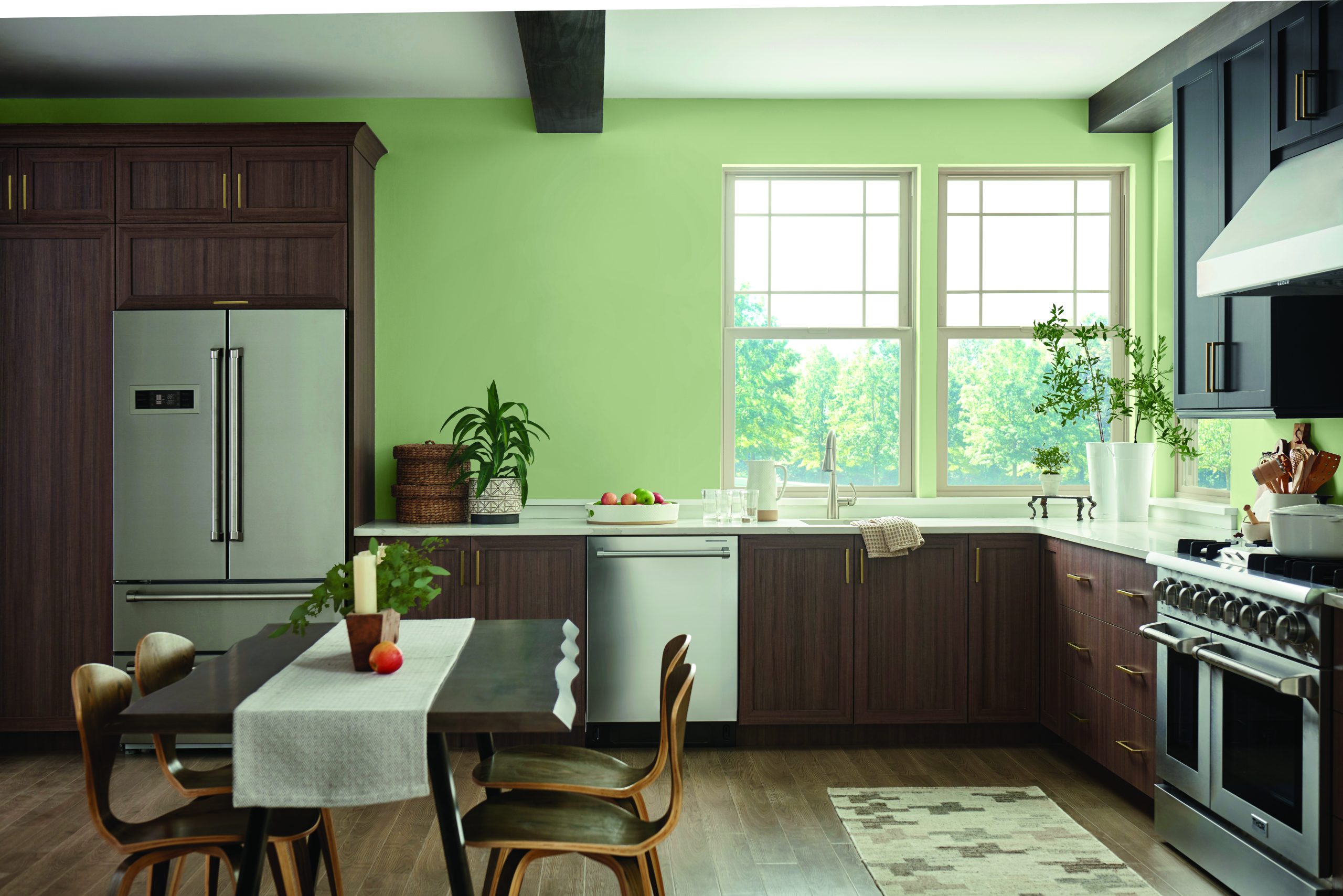
After a year of stay-at-home orders and too few IRL (in-real-life) moments in 2020 and 2021, homeowners, designers, architects and facility managers are craving authenticity, nature and meaningful human interaction after living in a mostly digital world. Our 2022 Color of the Year is Olive Sprig (PPG1125-4), an elegant, grounded, versatile and highly-adaptable grey-green. This color represents regrowth in a post-pandemic world and mimics nature’s resiliency.
Olive Sprig is a relaxed, but enticing green that emulates the feeling of soothing aloe vera or a fragrant plant – brightening any space with organic liveliness. A versatile color that lives well inside or outside, Olive Sprig blends in with nearly any environment.”
“As many of us know following a year of lockdown, the easiest way to shift your mindset is to change your environment. While we begin to trade sweatpants for strappy shoes, recipes for reservations, and a night in for a night out, our paint color preferences are shifting too, in both residential and commercial spaces,” said Amy Donato, senior color marketing manager, PPG paint.
Lending itself to be paired with natural materials, Olive Sprig looks beautiful alongside unique architectural elements and furniture with curved forms to create a comfortable and grounded space. The color can help create a sanctuary in a bedroom, encourage focus in an office, offer the perfect neutral backdrop in a retail or restaurant, and create a grounded getaway in hotels. Olive Sprig also pairs beautifully with brass accents and wood tones on an island or lower kitchen cabinets. Homeowners, designers, architects, and other customers of professional painters can also gather inspiration from this color through the use of floor-to-ceiling emerald tiles in a bathroom, incorporating a luxe velvet green couch in the living room, or immersing the home in plants in a variety of shapes, colors and sizes.
In addition, after the rise of working from home and remote learning, homeowners have shifted away from open concept living spaces to individual rooms in order to create privacy and compartmentalize working life from personal. For those in need of a little more separation, painting a wall or nook a different color from the rest of the room is a simple, affordable project that can instantly transform a space and help create boundaries in your home that will change and adapt as our lives do.
As part of PPG’s annual Global Color Forecasting Workshop, the company’s experts uncovered that consumers are more inclined to adopt more colorful selections after difficult inflection points throughout history, often seen during the Roaring Twenties or after the Great Depression. As part of this cyclical history, PPG is seeing post-pandemic optimism infiltrating commercial and residential design spaces so many can create a sense of escapism. Just as trends in the 1920s were marked by opulence, metallics, rich woods, layers, moody colors and angular shapes, today’s home décor is drawing inspiration from the Antiquity, Baroque and Renaissance eras of art, sculpture and architectural forms. This colorful embrace is thought to reflect an optimistic rebellion, a sign of personal expression or soothing self-care.
Sherwin-Williams Color of the Year
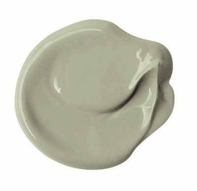
Easily hit the refresh button on any residential, commercial or architectural space with Sherwin-Williams’ Evergreen Fog, a simple, sophisticated color that is both calming and composed with just a touch of organic lushness.
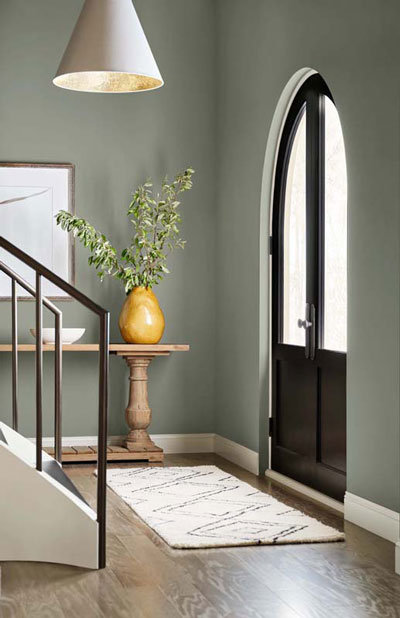
Our 2022 Color of the Year is a versatile and calming hue of gorgeous green-meets-gray, with just a bit of blue, depending on the light. It’s a simple but sophisticated wash of beautiful color for any exterior space. It allows you to truly discover the balance between the familiar and the fantastical—between seeking sun and rooting deeply. In the soft organic shade of Evergreen Fog, we find meaning, a place to heal, a lasting peace.
AkzoNobel
The forecast calls for Bright Skies™ in 2022, with the reveal of AkzoNobel’s Color of the Year. The airy, light blue feels like the breath of fresh air we all need.
After a spell of feeling shut in, people are craving expansion. Extensive global trend research conducted by a team of in-house paints and coatings color experts and international design professionals reveals that we want open air, connections to the great outdoors and a fresh approach to everything.
Many events over the past two years have thrown the social, economic and environmental aspects of our lives into sharper focus. We’re reassessing what really matters: family, friends, home and the world around us.
“In 2022, Bright Skies will help us embrace new ideas and shape a new future,” says Heleen van Gent, Creative Director of AkzoNobel’s Global Aesthetic Center. “The color reflects the limitless skies above us, giving us the space to redefine the role of our homes, nature, the arts and new voices in our lives. As consumers look to express themselves and transform their spaces, our aim as color experts is to inspire their color confidence.”
Dunn-Edwards has come up with a color that feels both nature-inspired and timeless. RF


